11.22.2013

Instagram Borders Are So 2012


From what I'm seeing, most people are not adding borders on their Instagram photos anymore.  Borders used to be basically standard-- part of the way we all looked to Instagram to make our less-than-spectacular mobile photos beautiful.

Now almost no one I follow regularly on Instagram uses them, or least uses them very rarely.  Why is that?  My guess:
  • we want the extra space to capture as much of our photograph moment as possible
  • "square" has become enough of a framing accent to a photo that borders often feel repetitive
  • borders have started to feel very generic + cheesy, exposing the repetitiveness of using the same stylized filters over and over
  • phone cameras keep getting better, so stylizing photos seems less and less necessary
That last point is interesting, because I'm even using filters less and less all together on Instagram photos.  Many of the filters can make a photo a bit grainier, less real.  Instagram is now the best place to share and enjoy photography as a whole, and and less a utility for making photos prettier.  It's replaced the camera on many people's iPhone screens.

I think these are pretty big and exciting developments in the Instagram ecosystem.  It's interesting to see, after all the bells and whistles, its the community that's most compelling.  And it contributes to Instagram's potential for longevity.

What does everyone else think?

10.31.2013

Why Auto-Expanded Images + Vines on Twitter is Bad News


This week Twitter rolled out a major change to the tweet stream:  auto-expanded photos and vines in users main feeds.  Now instead of having to click to expand the Twitter card to view some rich media content, a 437x218 px thumbnail will be clearly visible directly below the respective linking tweet.  The tweet stream change rolled out across web, iPhone and Android all at once.

While at first this might not seem like a big deal, auto-expanded content could have an immediately negative effect on user behavior:
  1. Auto-expanded images break the democracy of content in your tweet stream.
    Instead of scanning all content equally, users' eyes won't be able to avoid skipping to the next image. And instead of engaging with the most interesting content in their stream, users will be drawn to the most visually stimulating.  With Twitter prioritizing rich media over text, conversation and link sharing no longer has equal standing.  In other words, Twitter is on its way to becoming another Facebook or Instagram, instead of the maintaining its status as the world's quickest and most robust news feed.

    The effects of images in the tweet stream may not be immediately evident when everyone is just getting adjusted, but consider Facebook.  While much has been made over the years of Twitter's 140 character limit, the optimal post on Facebook is actually 80 characters or less.  With Facebook's emphasis on photo + video in the news feed, written text (even a minimal 140 characters text) can't compete for attention.  Is this what Twitter wants for its future?

    The auto expanded images and videos are also accompanied by now immediately visible reply + retweet + favorite buttons.  The buttons makes the tweet stream feel much busier and slower to scan than ever before.  This is most notable on the desktop, where as many as twenty or more buttons in repeating rows of four now clutter the page above the fold.

  2. Brands were just given a back door to banner advertising on the homepage.
    Brands invest a great deal of time, energy and money in building communities on Twitter and communicating with their followers on a regular basis.  Planning for auto-expanded images + vines will become an immediate best practice for brands that want to maximize message exposure and engagement. Many brands also have more human and capital resources to invest in creating imagery to accompany every post, which contributes to the uneven playing field in the tweet stream.

    This reality will be even more apparent when brand tweets are paired with Twitter's paid promoted tweets platform.  Promoted tweets are published "above the fold" in the first few tweet placements.  Promoting a tweet with an auto-expanded image will allow brands to serve up a prominent visual banner ad on the homepage of Twitter for the first time ever.

    It's important to note that while brands will (and should) take advantage of the new Twitter format, high quality + high value content will still be critically important.  This is reinforced in two ways: users being able to easily unfollow brands that clutter their tweet stream with noise, and Twitter's auction model that factors a brand's quality score into the cost of advertising.

  3. Two links and minimal text per post becomes the norm.  
    Since including images in posts will be required to attract viewers, images will now be included in posts even when the goal is to share a link to an article.  This is immediately becoming the standard for publishers, who are pairing image links with article links to draw attention to their articles.  Because Twitter requires 22 characters per link to wrap the link in their URL shortener, two links eats up 45 characters (including a space in-between) before any copy is even written.

    It's worth noting, as well, that the new auto-expanded images appears to break article preview Twitter cards.  So when publishers pair images with their article links to maximize attention in the tweet stream, they're prioritizing the new form of banner ad over the valuable content + context they were providing to their readers upfront, before the click.


  4. Twitter images + Vine videos get preferential treatment. 
    Ever since Instagram pulled support for Twitter cards, images that were uploaded directly to Twitter have been more visible on the platform than photos shared from their competitor.  However, while the Twitter cards imbalance was Instagram's choice, the new auto-expanded images feature now gives Twitter's own image format a distinct advantage over any other image hosting service.

    Now users can expect to see plenty of Instagram photos (and images created using other tools) downloaded and re-uploaded natively directly to Twitter's image platform.  Popular API hacking tool IFTTT already has a recipe for automating the process of porting a photo from Instagram over to Twitter images.  This will create fragmentation in engagement around the same content, duplicated across platforms.

    This home court advantage will likely help boost Vine's success, as well, which is critical as Instagram begins to roll out its own advertising format.  Branded video on Instagram, with its :15 second time limit, is expected to be incredibly popular with advertisers looking to bring video spots to the 150 million strong Instagram audience.  Auto-expanded vines paired with paid promoted tweets will be a powerful tool for Twitter to combat Instagram's new offering.
With Twitter's IPO just around the corner, auto-expanded Twitter images + vines may just be one of many big changes coming to the platform.  For the health of the platform and its long term potential, Twitter must think through the impact all of its design decisions will have on user behavior.  It also needs to evaluate clearly which values Twitter wants its platform to stand for.  Choices like auto-expanded rich media may seem small at first, but they could do more to disrupt the democracy + dialogue the platform has been known for than any other changes Twitter has made to date.

8.19.2013

Facebook Home, One Way Or Another

How Facebook for Android is a trojan horse for Facebook's larger ambitions.


You've got to wonder whether this strategy is written on the board somewhere prominently in Facebook's offices: do something extreme, make people uncomfortable, and then when it's been soundly rejected, take a step back and find a way to make it happen without anyone noticing.  Since the days of Beacon Facebook has done this time and time again.  Facebook introduces a major change that take invasion of privacy, lock-in and control to a whole new level, cause a crazy uproar. Then, when the uproar has subsided and nobody is paying attention anymore, Facebook finds a new, quieter way to accomplish the very same thing.  Even Facebook's stock price has taken that path, finally flirting with profitability after a tumultuous IPO.

The latest culprit of this bait and switch strategy? Facebook Home, Facebook's attempt to own our mobile operating system.

Facebook Home's launch may have been the company's biggest failure yet.  It was announced with great fanfare, with commercial partners, and with lofty claims about this not only being the greatest version of Facebook ever-- but a whole new way of experiencing mobile.  The problem was, though, Facebook Home took mobile lock-in to a whole new level by suppressing much of what people do on their phones a layer below Facebook's own features.  It also showed a complete misunderstanding of the motivations of many Android users.  The result was a minimal usage and HTC's Facebook Home phone being discounted to 99 cents within a month of going on sale.

But as we should know by now Facebook never gives up.  While almost no one is using Facebook Home, a tens of millions of people are using Facebook for Android.  And Facebook Android app, it turns out, is the perfect back door to introduce Facebook Home features away from the critical public eye.  First came Chat Heads, Facebook Home's clever and fun messaging platform.  Then came Cover Feed, Facebook Home's very attractive newsfeed screensaver.  Both features were introduced as opt-in options, and I've activated each as soon as they were available (note: as a Facebook for Android Beta tester, I sometimes receive updates earlier than the general public).

As it turns out, Facebook Home's best features are pretty great.  Chat Heads makes messaging much more accessible than ever before by elevating text messages above the Android application layer so you can send messages without having to leave what you're doing.  And Cover Feed makes turning on your phone a few hundred times a day much more interesting and enjoyable by introducing new photos and status updates from your friends in beautiful full bleed panning display that you can 'like' or comment on immediately, every time the lock screen appears.  My Facebook usage had waned considerably over the years, but since turning on Cover Feed I've browsed and interacted with Facebook at exponentially greater volumes.

One day with Cover Feed and you can see why Facebook wants this so badly.

Facebook turning its regular Android app into a trojan horse for Facebook Home features isn't going to solve all of its problems.  Cover Feed is great, and new features seem to be getting added regularly (just this week Facebook added support for audio controls in the lock-screen).  My biggest critique with Facebook Home when it first launched was its blatant disregard for 3rd party applications, which it needs to play nicely with if it wants to own more real estate on the phone.  I'm loving Cover Feed, but I'll be more likely to stick with it if I can integrate photo streams from other applications as well (first-up, how about Instagram support, which at the very least is part of Facebook's own family?).  And Facebook is still quietly working on Facebook Home, hoping to get it to a place where Android users consider it a compelling alternative to the stock operating system.

It's clear to me, though, whatever happens-- one way or another, we'll all be using a version of Facebook Home sooner or later, whether we realize it, like it, or not.

7.02.2013

Replacing Google Reader


Today is the first day us geekerati won't be powering our daily reading with Google Reader (at least those of us who still rely on RSS).  There were many of us who loved and relied heavily on Google Reader, and I wrote a story about how hard it is when a beloved product doesn't love you back.  But the question I'm being asked is, what are you doing now for RSS reading?

#1. Backing up my Google Reader data
Google has enabled us to export all sorts of data from Google Reader via its personal archive service Google Takeout, including a list of all of your RSS feed subscriptions, starred items, and more.  I exported my Google Reader data and stored it to Google Drive.  You only have until July 15th to do this, so get on it.

#2. Creating an account on Feedly
If you're a power RSS reader, you need an RSS reader that is flexible, personalizable and accessible on all of your devices.  Feedly is a good choice because it's an RSS reader in itself and has also built an API backend to replace Google Reader's 3rd party application community.  I am not in love with Feedly itself (it always seemed to pretty to me), but its leadership position in the RSS marketplace means it's dependable for all my needs.

#3. Transitioning my mobile applications
I do most of my RSS reading on my phone, and often underground in the subway.  I rely on power RSS reading apps that let you cache feeds to read offline, skim lots of content quickly, and sync data among other things.  I've opted for Reeder on iOS and Press on Android, both because they're the best in their respective marketplace and because they both sync cleanly to the Feedly cloud.

#4. Testing out new RSS products
While I'm relying primarily on Feedly, Reeder and Press right now, I'm also exploring other options.  The one I'm most excited about is Digg Reader, a very new product from the Betaworks team that is being developed with the power user in mind.  I love the synergistic social news ecosystem that Betaworks is developing with Digg, Digg Reader, Bit.ly and Instapaper.  They have a long way to go towards making this a reality, but I'm optimistic.  I'm also considering testing Feedbin and News Blur, two cross-platform RSS readers that have admirably put a stake in the ground for a paying business model that could help sustain them long term.

So that's my post Google Reader RSS plan right now.  What's yours?

Additional reading: A bittersweet goodbye to Google Reader, the online girlfriend who dumped me.

6.21.2013

But Do People Really Want Video on Instagram?


This afternoon Facebook held an event to announce video capture would finally be available to Instagram's 130 million users. The experience of creating a video is ripped right from Vine (touch and hold to record, lift your finger to pause), which is good because Vine was the first mobile video product to be welcomingly easy to use. Instagram video also has some interesting new bells and whistles that differentiate it from its video predecessors-- video stabilization, filters, and the ability to import content, to name a few. With Instagram video you certainly have the ability to create a more visually compelling product than ever before, in a way that feels very native to the Instagram experience. But I have to ask, after the initial excitement is over, will people really want that?

Part of the magic of Instagram is its innate ability to make any photo instantly attractive. It essentially created the idea of "one touch magic button" apps that is now a benchmark for how simple and powerful a mobile product should be. But while adding stabilization and a filter might make any video more attractive than it was to start with, it does not in itself make every video interesting enough to spend 15 seconds with. In fact, applying the promise of Instagram magic to video content might even make viewers more upset when they stop flipping through beautiful photos long enough to watch.

That's my biggest concern with Instagram video. It's great that Instagram has developed such amazing tools to make regular video better looking. But if the Instagram community starts being bogged down by :15 second videos that would have been a lot more interesting and native to the experience as photos, it will make spending time in Instagram a lot more weighty. Almost like your friends ran a :15 second ad in the middle of your beautiful photo stream. I'm already feeling this in the first day-- browsing the feed is slower, and it's more complicated to discover new interesting content in the "Explore" tab. Myself and many others open Instagram countless times a day to briefly scan through the latest photos for a moment break and smile. A steady stream of sub-par video will make that a bigger lift, and less enjoyable.

Now how does this all compare to Vine? Vine has been so successful because if provides the right balance of capability and confinement. In 6 seconds people can be as creative as they want to be (and there's been some truly impressive Vine art). But 6 seconds also limits uninteresting content in a way that doesn't disrupt the flow of scanning content that is necessary in social platforms like these. Vine's limitations somehow lower the bar for what video content has to achieve to be compelling, and that's what so differentiating and impressive about it. It's also established itself for what it is-- browsing the Vine stream you get exactly the experience you're looking for. Wouldn't it be strange if people could suddenly start taking pictures with their Vine app?

So while I'm very impressed with the video product that Instagram has put together, and I'll probably even use it every once in a while, I don't think it's going to be the market disrupter that Instagram originally was. I don't think it's going to be the magic bullet to make ammateur video instantly more proliffic and compelling than before. And I do actually think one of two things will happen-- people will not use it all that often, or Instagram will add some sort of view filter that lets people browse only photos if they want to, to preserve the amazing experience they've been cultivating since their launch. And Vine, and other single-purpose apps, will continue to flourish despite Facebook's relentless attempt to take the whole cake.

At least I hope so.

Disclaimer: The SS+K Lab that I co-founded built the popular Vine search engine VineViewer and has previously built applications for Instagram, as well. We love both equally :)

5.19.2013

Why Tumblr Should Sell to Twitter Instead

Awesome photo borrowed from The Verge
If the rumors or to believe, the ink is drying as we speak on a deal for Yahoo! to acquire Tumblr.  This is Marisa Mayer's biggest move yet in her effort to make Yahoo! relevant again.  I'm a big fan of Marisa and rooting for her to bring magic to properties that Flickr that I still rely on.  But as a Tumblr user, I can't help but wonder if this is a terrible fit.  In short, here's why: Yahoo! has a horrible legacy with forced integration, has never been innovative when it comes to monetization models, and is lacking any real creative credibility at the moment.  Tumblr users, myself included, have to be worried about all of these things.

As a regular user it may seem funny to think so intensely about the business functions of free consumer platforms  like Tumblr, but the truth is we have to.  Tumblr founder David Karp fought the good fight by keeping regular banner advertising off Tumblr's enjoyable platform for so long.  But free platforms have to make money somehow, and as we're learning time after time, the harsh reality of business is often bad news for us.  The question is whether Yahoo! is capable of recouping a $1.1 billion investment in Tumblr in a way that makes sense for itself and the Tumblr community.

Advocates of this deal will point to Google's successful acquisition of YouTube as an example of how the relationship between Yahoo! and Tumblr should be structured.  But YouTube actually benefited immensely from Google's ownership and was more synergistic than it may be looked on the surface.  Google's infrastructure innovations have helped reduce the operating expense and increased the compatibility of the platform.  Google's ad targeting and performance pricing were both exactly right for YouTube.  And search is incredibly important for YouTube.  Does Yahoo! have that type of synergy with Tumblr?  I'm not so sure.

If Tumblr really had to sell, I would have much rather seen Twitter as the acquirer.  In many ways, Tumblr and Twitter are incredibly compatible.  David Karp and Jack Dorsey are both creative leaders who have proven they care about user experience.  Tumblr's diverse content posting platform would be a perfect way for Twitter to fill in support for all media types in its growing Twitter cards platform.  Tumblr has recently started making money through native advertising techniques that replicate Twitter's monetization-- promoted posts and promoted accounts--  and both platforms approach the advertising with careful restraint, which is greatly appreciated by users as compared to Facebook.  Twitter and Tumblr also both have the respect of a younger audience, which means their loyal fans would probably not be appalled and run for greener pastures if the acquisition took place (which is a major fear should the Yahoo! acquisition go through).  Both companies use tagging and topic pages to tell cover events and tell stories through the power of their users.  The examples of synergy go on and on.

Yet again we users are in a scary situation as a company we considers its on future.  It's time for users to take some responsibility for these fates.  We have to signal the ways in which we'd be comfortable with the services we use making money.  We can be willing to pay, we can appreciate and support good ad experiences, we can willingly give up our data.  Hopefully users and companies can work together to ensure the product we both love can thrive and secure their own fates.  And if that's not possible, hopefully companies can make smart acquisition decisions that lead to outcomes like YouTube, not Flickr.  I hope I'm wrong and Marisa Mayer is the right parent for the job.

5.17.2013

The subtlety of (don’t be) evil

The subtlety of (don’t be) evil: considering Google's ambitions
[A blog post I wrote for Medium, but never published, after Google IO]

In the aftermath of Google’s annual IO conference that ended with an impassioned speech by Larry Page pleading with the tech industry to stop fighting and start focusing on making the world better, it’s worth revisiting Google historic Don’t Be Evil mantra. The irony was not lost on anyone when, at the same time Larry Page was preaching unity, Google lawyers were requesting that Microsoft pull their recently launched YouTube app from the Windows Phone Store.

Here is why I believe in Google, why I buy into their mission: more often than not, Google’s work helps make the world better. Whether its breaking new ground with products no one ever thought of, or entering competitive industries that already have clear leaders, its typically doing so to significantly benefit us all by starting massive leaps forward.

Oftentimes critics label Google’s ambitions in productivity (i.e., Google Docs), web utility (i.e., Chrome), Geography (i.e., Maps), and mobile (i.e., Android) as evil because they were competitive efforts in someone else’s industry. But in each case, Google helped drastically change the market for the better. Microsoft wasn’t innovating with its Office product and clearly had no vision for the era of web connectivity. Firefox had done the hard work of unseating Microsoft’s hold on the browser market, but it took Google’s entry into the industry to ignite the incredible acceleration in web browser speed, standards compatibility and cross-platform sync. Google Maps proved MapQuest was actually a laughable product that was doing a fraction of what mapping was capable of. And while Apple made the biggest contribution to the mobile industry ever by breaking the carrier stranglehold, it needed a foil in Google to expose the value of open platforms. In each instance, Google entering the market has ignited competition that has lead to greater and greater products and services for users.

For me, whether Google is acting evil or not is determined by whether it can really effectively make a difference in a market it enters, not just steal someone’s revenue.

4.07.2013

Facebook Home is a beautiful, but contradictory, vision for our mobile future

The rumors of a Facebook phone have been around for years now. And with each new mobile app or functionality that Facebook launched-- Facebook Messenger, Facebook Camera, Facebook Messenger with voice calling... the noise grew louder. But the question always remained: a Facebook phone sure seems great for Facebook, but why is it great for us?

Finally on Thursday Mark Zuckerberg walked on stage and gave us our answer in the form of Facebook Home. Its not a phone, he said, its a whole new way of experiencing mobile. Its a paradigm shift from apps to people. Its the way mobile social was always supposed to be. Oh and by the way, its the best version of Facebook yet.

Well therein lies the rub. Mark Zuckerberg did unveil a beautiful vision for the future of mobile. The immersive cover feed seems like we could get lost in it for hours. Elevating chat above the app layer is a stroke of brilliance that changes the meaning of multitasking. It certainly feels right to be looking at people and actions, not apps.

But by its very nature, the Facebook phone-- or loader or whatever you want to call it-- is a contradiction. It simply turns your smartphone into one big Facebook app, suppressing almost anything but Facebook's already people-first behavior. Its a glorified app at the expense of how people really exist today-- as a multitude of experiences and behaviors across a wide variety of platforms and ecosystems.

You see, people today don't just want to communicate on Facebook. They want to stream news on Twitter, express themselves on Tumblr, explore on Foursquare and more. A Facebook phone can never really become the world's first truly people-first phone unless it embraces every way people really communicate. Facebook, on its own, cannot be a phone for the people.

Mark Zuckerberg mentioned several times on Thursday how Facebook Home wouldn't have been possible without the amazing commitment by Google to make Android open. If Zuckerberg really wants to be the champion of a people-first mobile future he should match that by building Facebook Home to embrace all of the other interactions, on Facebook or otherwise, that people want to have. THAT will be the best version of Facebook yet.

2.11.2013

Trading in my iPhone 4S for a Google Nexus 4


Ever since I fell in love with the Google Nexus 7, I've been thinking about trading in an iPhone for an Android phone.  As I mentioned before, I think innovation in the mobile Operating System space is largely coming from Google (and even Microsoft) right now, and in comparison Apple's iOS is starting to feel stale.  The release of Android 4.1 Jellybean this summer was a turning point for Android, but there wasn't a phone worth buying yet until Google released the Nexus 4, a flagship phone in the same lineage of Nexus 7 that would always feature the latest version of Android.  As lucky would have it, I won a new Nexus 4 at a Google event, so this week I decided to take the plunge. 

I popped the sim card out of my iPhone and transitioned full time to an Android phone.

I'm going to spend a lot more time with the phone before I give an official review, but until then it's worth sharing some my initial reactions for anyone about to make a similar phone change cold turkey.  The phone itself is beautiful.  It's slim and light, but with a big beautiful screen.  Multi-tasking and cross-app integration is pretty fantastic (as It's always been on Android).  Voice recognition and other typing alternatives like native swype-style keyboards make information input a breeze.  The operating system is much more informative and actionable-- from better app notifications, to better data about your power usage.  And I have really high hopes for Google Now.

But there's also a lot of surprises.  Though the phone is very fast, the touch response feels a bit slower, akin to how Windows trackpads often feel compared to Apple.  And even though the operating system itself is fantastic, many applications aren't matching it in quality.  It seems many companies delay in rolling out their best features to Android, so applications I love on iPhone are only subpar on Android (for example, Evernote Hello doesn't have business card scanning functionality yet, and Nike+ doesn't have friend leaderboards or Path integration yet-- both popular features on their iOS equivalent).  And some great apps are still missing all together.

Also, Android's old selling point-- the most powerful versions of Google own applications-- isn't even true anymore.  The latest versions of Google Maps, Gmail and Google+ on iPhone are pretty killer, even better, I think, than what's on Android right now.  I think this is because on iPhone Google has a the highly evolved standard gestures of iOS, a refined standard that doesn't yet exist on Android (things like pull to refresh, left-swype menus and click-to-top headers).

So it will be an interesting ride.  I can already see a ton of pluses and minuses of both iOS and its standard hardware build (the weight and size is definitively easier to hold, but harder to read on) and the operating system (a more open OS leads to better integration but less polished functions).  I'm sure I'll learn a lot more as I spend an extended period with the phone.  And then come July, when the next iPhone comes out, I'll be ready to make an informed decision on what platform I'm going to commit to my next two years.  In the mean time, let me know if you have any Android suggestions or questions.

2.08.2013

Our Vineviewer Vine Search Engine Gets Some Love


We launched our labor of love VineViewer (a Vine video search engine) to the public one week ago now.  It's been an exciting seven days, so I wanted to provide an update on our web app.

Since roll-out, our development partner Firefall Pro has been killing it with feature updates and stability optimizations.  Now each Vine video has its own "card" which includes a link to the video post's original Vine post page as well as the shared Twitter post page.  You can search for multiple keywords at once, and search results now have unlimited scrolling.  Videos fail much less often, but when they do, we serve a nice error graphic instead of a 404 page.  There's a new "about" message that appears when you roll over the corner plus (+) graphic.  And the design is a lot cleaner overall.

We've gotten some pretty awesome coverage in the press:

And most of all, people seem to really enjoy using it.  Over 2,600 people have used the app so far, to search for everything from video game clips to peeks at the winter storm Nemo.  And the average visit duration is climbing to now over 3 minutes per visit (amazing, considering Vines are 6 seconds).

I hope VineViewer grows as a part of the Vine community.  We'll be thinking about ways to make it more useful.  In the meantime, continue to share it, and let us know what you think.

2.01.2013

We Built a Vine Search Engine


Last week Twitter launched a new video product called Vine, which enables users to quickly & easily record and share 6 second videos. Vine's big innovation is its way of enabling people to stitch a video together without having to use any editing tools, the result of which is a drastically lowered barrier to making an interesting looping clip. I'm loving Vine because vine videos feel really raw and intimate, characteristics that are unfortunately sparse these days now that just about every photo is cropped to a square, filtered and bordered.

But as much fun as it is to watch Vine videos, there's unfortunately no way to easily search for vines of topics of interest.  Enter VineViewer:
VineViewer is a fun utility developed (rapidly) by SS+K and Firefall Pro designed to allow people to search the growing library of vines based on their tags. We were really excited by the launch of Vine. Like everyone else in our business, we immediately began thinking of different ways we might bring vines in on our client work. In doing so, we lamented that there was no simple way to search for vines of a specific topic, like love for Valentines Day. 
VineCreeper is in in constant beta, and may evolve as we come up with more ideas for Vine. We hope people enjoy, and use at their own discretion.
We concepted and created VineViewer in just a couple of days, to fill a need and interest we had.  It's certainly rough around the edges, and there are some more features we'd like to implement (like a widescreen view and endless scrolling), but we wanted to launch it immediately for all Vine lovers to enjoy.  Learning about new social tools is all about using and prototyping, not polish.

So search for cats, puppies, babies and NYC to your hearts content.  Let me know what you think, and share it with your friends.

1.23.2013

Blogging is set to have a new golden age

The welcome screen of Medium.com (created by Biz Stone & Ev Williams of Blogger + Twitter fame)

Today Quora announced a new blog functionality.  It's not surprisingly getting a lot of attention because, on the surface, it appears to be a pivot for the company.  But in reality it feels like a natural extension of Quora's platform, in support of Quora's core mission
Quora's mission is to share and grow the world's knowledge
And while interesting, smart question asking has unearthed some even more amazing knowledge, without the right question a lot of great knowledge won't be published. So Quora's blogging product enables everyone with something great to say about a topic to contribute to it through a blog post.  That's Quora's innovation on blogging, by the way -- adding the ability to post original insight to a topic, without having to worry about building a following.

But Quora's new blog product is just another developing in an even more exciting trend: a new golden age of blogging.

After years of stagnation in the blogging space, the last few months have seen a flurry of blogging innovation.  Svbtle, Medium, Branch, and Quora have all created new publishing platforms that embrace smart, intelligent writing in unique ways.  They all embrace design as a way of enhancing the writing and reading experience.  And all of these platforms are helping to fight back against the trend of character counts, meme machines and animated gifs.

Branch, in particular, has me really excited because of how it's making social dialogue interesting again (more on this from me soon).

So if you've forgotten what it's like to write longer than 140 characters, or you're tired of just seeing auto-animated images, and you want to dive into some really interesting, thought-provoking content, start exploring one or two of these new platforms that are helping reignite a new golden age of blogging.  And share with me what you've found.

1.21.2013

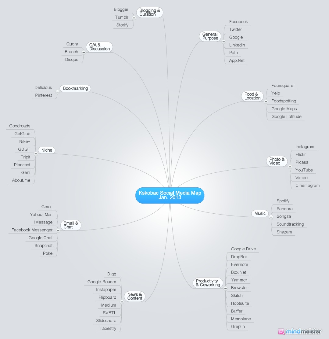
My Social Media Footprint, January 2013


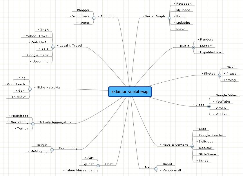
At the beginning of the year, I like to take stock of the websites, apps and technologies that I'm using on a regular basis.  This time I returned to an exercise I performed four and a half years ago when I drafted a map (see below) of my social media presence.  The social web has grown exponentially since 2008, so obviously there are more properties than ever on my map.  But what's more interesting is some of the trends that are illustrated.  

For starters, websites, apps and tech have all merged so much so that doing different lists seems a bit silly.  For this exercise, I used a loose definition of listing websites & apps that revolve around social interaction, be it creation, communication, management or sharing.

Also, many sites have changed classifications since 2008.  For example, my old graph has Tumblr listed as an aggregator, but since then Tumblr has switched from a pull-type service to a creation platform.  In fact, aggregators as a whole have basically gone away.

And social productivity was certainly a thing in 2008, but it was an outlier, not a tentpole category as it is now.  That feels like a reflection of the evolution of corporate IT, which has largely embraced things like Google Apps, DropBox and Evernote.

It's crazy to think how many social properties I've enjoyed that weren't even around four years ago, and amazingly are already obsolete (things like Posterous).  And certain categories are starting to be disrupted again, though they were relatively stagnant all this time.  Blogging is one of them.

I look forward to doing this exercise many times over in the years to come.  It's always interesting to sit back and take stock of how the web is evolving.  For the sake of comparison, here is my map from 2008.


1.15.2013

7 Discoveries and Observations from the CES 2013 Conference Floor


1. No matter how good you think your TV is now, it can always get better.
This year television manufacturers showed off new Ultra High Def (UHD) televisions that have 4K resolution, or about four times the resolution of today's high definition screens.  These big and beautiful TV's show virtually no pixelation when displaying UHD content (though upscaling non-UHD content may be less compelling).  Also present were new curved televisions that enable viewers to have a more balanced viewing experience (each inch of the screen is equidistant from the viewer), and an impressive dual-view 3D TV by Samsung that enables two people to watch different high definition 3D broadcasts in full screen at the same time from the same television.

2. It's more fun to use human interfaces and have physical interaction.
While TV's, phones, computers and cameras steal the headlines at CES, smaller companies tucked away in the corners innovating in ways you can't imagine are much more fun.  And many of these companies are helping us to interact with the world a bit more by building physical interaction into technology.  One particular cool gadget is Sphero, a hackable robot ball that you can control via your iPhone, around a physical track.  Sphero can also trigger augmented reality experiences, and be used itself to control computer programs through physical manipulation.  Also peek at Sifteo cubes, small computer cubes that pass information between each other, enabling all sorts of interactive puzzles and games.

3. Health technology and the quantified self are at a tipping point.
All sorts of companies are making health-tracking devices, from health start-up fitbit, to Nike Fuel to Jawbone Up, that track anything from how many steps we've taken to how well we're sleeping.  But wearable bracelets won't be the only way we measure, share and analyze our health data.  Withings has a connected scale that measures your weight, BMI, heart rate and even the air quality around you.  As more companies enter the health tracking fray product innovation will collide (Withings has a wearable monitor now, and Fit Bit has a connected scale).  The bigger question will be how well these companies can guide our real life health improvements based on all of the data we're collecting.  

4. Every device will be connected soon (so plan for bigger data plans).
Just about everyone seemed to enjoy playing with Samsung's new Galaxy Camera, an internet connected digital camera with an Android operating system built in.  Now you can install your favorite mobile apps like Instagram right to your camera to filter and share photos as soon as you take them.  Samsung also showed off a connected refrigerator that includes popular applications like Evernote, so people can collect recipes from anywhere and browse or view them directly on the screen in their kitchen.  With the internet of things growing so quickly, ubiquitous connectivity and shared internet plans will need to improve along with it.

5. Kickstarter is one of the most exciting names in consumer technology.
One of the most anticipated announcements at CES was from Pebble, the ambitious smart watch that was funded on Kickstarter.  The Pebble raised a record-setting $10 million dollars to build their product back in April, but didn't announce their shipping date until CES.  If Pebble lives up to its promise once in the hands of consumers, the next CES might be much more focused on the independent technology innovators that are arising in part to innovative funding models like Kickstarter, rather than the big behemoth technology companies that lead the market today.  In fact, many of those big market leading companies seem to be pulling out of CES all together.

6. The big four internet companies are confusingly second fiddle at CES.
Google, Apple, Amazon and Facebook, known as the big four internet companies, have become successful through their merging of content, services and technology in a user-friendly way.  Each, to different degrees, are defining what it means to be a connected product today, from user experience to content to ecosystem compatibility.  And while CES is full of other companies making devices for those platforms, the names defining the space need to stand up and illustrate their vision for the future.  There may have been hundreds of devices from different companies on the CES floor that included Android, but Google needs to lead the discussion of how all these devices will work together with Android at its core.

7.  Welcome to the new CES, it's not just a trade show.
The biggest story going into the week was actually how few product announcements would be taking place, with many technologies likes cameras and phones now saving their biggest own popular trade shows later int he year and big names like Microsoft having left altogether.  But a reported 150,000 people from all walks of life attended the convention this year, the largest audience in CES history.  More significant may have been the tens of thousands of brands, sales and marketing companies who spent the week in Las Vegas talking about the implications of the consumer electronics revolution and its implications on media and marketing, without ever stepping on the conference floor.  CES may be changing, but for new reasons its just as interesting and important none-the-less.