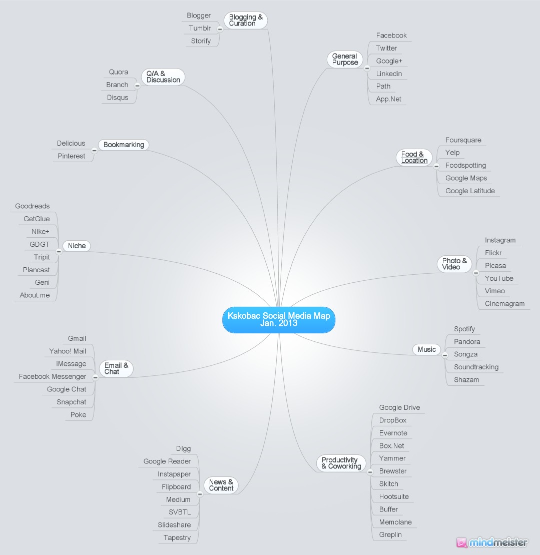
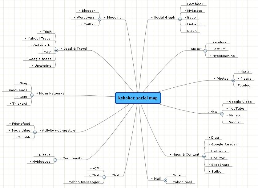
At the beginning of the year, I like to take stock of the websites, apps and technologies that I'm using on a regular basis. This time I returned to an exercise I performed four and a half years ago when I drafted a map (see below) of my social media presence. The social web has grown exponentially since 2008, so obviously there are more properties than ever on my map. But what's more interesting is some of the trends that are illustrated.
For starters, websites, apps and tech have all merged so much so that doing different lists seems a bit silly. For this exercise, I used a loose definition of listing websites & apps that revolve around social interaction, be it creation, communication, management or sharing.
Also, many sites have changed classifications since 2008. For example, my old graph has Tumblr listed as an aggregator, but since then Tumblr has switched from a pull-type service to a creation platform. In fact, aggregators as a whole have basically gone away.
And social productivity was certainly a thing in 2008, but it was an outlier, not a tentpole category as it is now. That feels like a reflection of the evolution of corporate IT, which has largely embraced things like Google Apps, DropBox and Evernote.
It's crazy to think how many social properties I've enjoyed that weren't even around four years ago, and amazingly are already obsolete (things like Posterous). And certain categories are starting to be disrupted again, though they were relatively stagnant all this time. Blogging is one of them.
I look forward to doing this exercise many times over in the years to come. It's always interesting to sit back and take stock of how the web is evolving. For the sake of comparison, here is my map from 2008.


