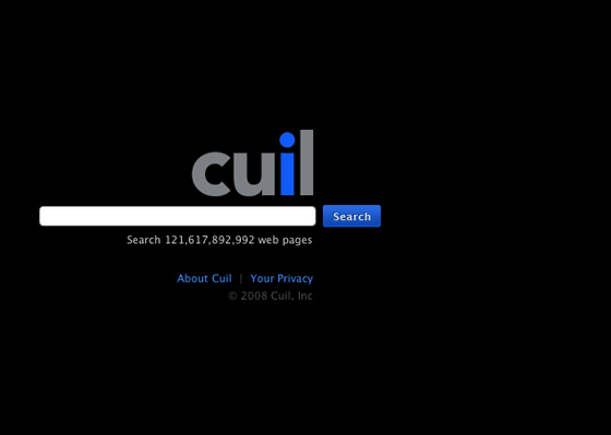
This morning a new search engine Cuil opened their doors, and it's getting a lot of press. Part of the reason is it's got several ex-google people at the helm, and it's also making claims that attack at Google's core competencies - scale, index size, efficiency, even simplicity. At the end of the day, most of these things don't mean much to every-day users, so it really comes down to how helpful the results are. Early feedback is that the initial results from Cuil aren't as strong as Google's, but their secondary filtering that shows up via their tabbed recommendations on top and side are proving to be on point and helpful as pre-populated follow-up searches that you probably would have had to type in on Google anyway. The most notable difference is also the fact that results by default show up in 3 columns, and with much more text - almost a paragraph - giving you a full page of responses that seem intended to be more valuable as a composite answer to your query than a list of ranked leads to the answer. I did my usual vanity search for "skobac" on Cuil and it wasn't very on-target; most of the results were for a social bookmarking service that I registered for and never used, and it completely skipped my personal blog, my facebook account, etc, the things I update almost daily. It also didn't reveal anything on my uncle, a notable Orthodox Rabbi, until the second page. More importantly, the Cuil launch draws attention to the explosion of high profile start ups that are trying to move gain mind share and search share through a variety of new angles. Here are a few that might continue to draw attention, influence the search engine mains stays (even Google), and in some way might even help you in your search needs:
Mahalo - brainchild of Jason Calacanis, Mahalo is a wikipedia-like search engine that focuses on expert guides to queries. The Mahalo model presumes that people only really care about the top stuff anyway, so why not make it short and sweet and give it to them. Mahalo guides pull together the final product, but anyone can suggest links for topics, and the user-generated search engine has seen strong growth since opening up. A good example of optimal use is "San Francisco Vacation"; it also pushes editors to develop pages on breaking content in real time. The best part about Mahalo is possibly the firefox extension they built to integrate Mahalo expert recommendations into Google; this way you can search as you usually do on Google, but if Mahalo has a valuable addition to your query, it gets added in on top.
Powerset - now acquired by Microsoft, Powerset is a semantic search engine that is trying to crack the code of "natural language filtering"; in other wrods, it tries to understand what we're really saying in those search quieries, rather than just matching words. It's perhaps the most challenging undertaking with the biggest upside, and numerous search engines are trying to crack natural language filtering, but Powerset gets the attenion because Microsoft just acquired it and the technology will start to influence Live.com search results before the end of the year. It also has a powerful proof-of-concept built out around Wikipedia, which provides a much more robust and powerful search engine for the enormous and popular social encyclopedia. Powerset tries to give you results that actually answer your question, rather than just bringing you places to find the answer, and they provide numerous examples of this in action right on their website, such as "what are the ingredients in beer"?
Searchme - designed under the premise that people take more from visual experiences, Searchme is a lightning-fast search engine that generates results in cover-flow style, as an iTunes for search. You can flip through the results and see full page screenshots, with the search terms highlighted, as well as a summary of the site at the bottom. It also enables you to filter between web, video, and image results, as well as by category. An example search of "Barack Obama" offers you filters by political news,, business news, democratic party, or more. I don't see why it helps much in every day searches, but it's great for image search, and the ability to create custom "stacks" of results makes it a helpful way to create a screenshot collection of best pages for a particular topic to save for viewing later, or to recommend to someone else. Any other time you want a visual preview of the results, it's definitely the fastest and most functional visual search tool ever designed.
At the end of the day, Cuil, Mahalo, Powerset, and Searchme may not show enough of a difference in utility to change your normal search patterns (more often than not we all default to Google), but it does show us that search isn't over, and that there are potentially new, interesting, and hugely impactful innovations in search. If anything, the attention that these new startups draw, and the high-stakes of losing even a percentage point of use to one of them, puts pressure on the Google and the like to keep inovating themselves, keep progressing in usability and value, in order to maintain and grow their own search king status, and that is incredibly important as they start to reach monopoly size market proportions.
7.28.2008
Avoiding the Google Default: Search Isn't Over
7.25.2008
This Barack Obama: This kind of worldwide popularity is something we need in the US right now

[reblogged from Fredwilson.vc]
7.21.2008
Review: I eat delicious steak at Quality Meats
[cross posted on Yelp and Google Maps]
Quality Meats gets the one thing right its supposed to - the steak. It's not a perfect restaurant by any means; it's overpriced (I was there on business), and certainly has a visiting audience of gold diggers, but the food was great and the steak was outstanding. We started with a seafood tower, where the shrimp, lobster, and crab were delicious. As someone who isn't always thrilled with seafood, I can honestly say the fish here was fresh and tasty. I can't really remember the sides we ordered, so they were neither impressionably good or bad. The steak I ordered was their blackberry fillet, marinated in blackberry sauce and covered in fresh blackberries. Not only was this a unique preparation, but it was also outstanding delicious. The meat itself was cooked perfectly - the right type of lightly crisp on the outside, and soft and pink on the inside. I've been to many of the major steak places in New York City, and this was one of the best slices of meat I've eaten in 4 years here by far, a dish I can't say enough about. Finally, I finished with the cookies & cream ice cream, which is home made daily with vanilla ice cream mashed with oreos and fresh soft baked chocolate chip cookies, served sandwiched between fresh soft baked chocolate chip cookies. It was, as well, as good as it sounds. All in all, if you have someone paying for you, I'd definitely go to here - I would be very happy getting the exact same meal again.
7.11.2008
Shakespeare in the Parking Lot

Last night I went to see Twelfth Night performed by Shakespeare in the Park(ing) Lot. The theater troupe has been performing Shakespeare plays in Parking lots with the permission of the NYC Transit for 15 years; they perform in an active parking lot, picking up the set and pausing the action as cars come in and out (it only happened once while I was there), they store their set at a bar across the street, and they jokingly report that refreshments have been arranged at the McDonalds and Popeye’s around the corner. The shows are done with minimal props and given a little bit of modern interpretation, with one or to New York City references and some songs on guitar added in.
If you’re looking for an entertaining and different night out – grab some food and head to the parking lot early to grab the few lawn chairs they have (we arrived around 7 and we some of the first to arrive for the 8pm show); you’ll enjoy it, and for the price of a requested donation, you can’t beat it.
See more pictures of the night here, poorly taken from my camera phone
check out more details and the upcoming shows
7.08.2008
The New iGoogle vs. The New Facebook - iGoogle Will Change My Day More
 A lot is being made of the new Facebook profile redesign (a sneak preview being opened to the public week of July 14th) - and there are a few reasons for this. First of all, millions more people use Facebook than iGoogle, both in the US and worldwide. Also, Facebook over time has near unusable and unvaluable - the news it gives me is either not very important, or it is about the tens of people I want just as 'contacts' and not as 'friends.' Facebook's new redesign may clean up the profile page, but what I really want is a way to filter out the noise from people I don't care about day-to-day, similar to what Plaxo allows. If that doesn't happen, that I don't expect expect much to change in my Facebook experience when the profile is redesigned.
But could potentially be much more interesting and seems to be getting overlooked is the redesign of the iGoogle homepage, Google's personalized homepage offering. Last week iGoogle started allowing users to opt in to an early test of the new page; the new features that are being built in right now are the tabs moving to the left, chat being integrated similar to the way it is in gMail, full page views of gadgets (canvas style, similar to facebook's expected adjustment), and an activity feed. To me this change has the potential to turn iGoogle into what Facebook wants to be - a platform for the web. As more and more of Google's offerings get integrated together, and enabled to work inline so that I don't need more tabs or page refreshes, the Google web-desktop package becomes more powerful and more to life. If I can check gMail, chat, view my RSS feeds, and browse Facebook/Twitter/Friendfeed via gadgets, all within the comfort of my iGoogle homepage, I don't see myself needing to leave very often. I could do most of this before, but better inline use of gadgets and the addition of gChat means I will less and less have to leave my iGoogle homepage to do anything I want to do.
The new iGoogle definitely has a way to go - chat isn't working for me yet, the canvas pages load poorly, and gMail isn't opening email inline. But the promise of iGoogle seems big, and if they get their act together it significantly change wear I spend my time online on a daily basis. Much more than I'm expecting from Facebook's new profile next week.


